- July 22, 2023
- Luis Carmona
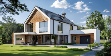
In the world of design, color is a powerful tool that goes beyond mere aesthetics. We know how the strategic use of colors can significantly impact the mood and emotions of individuals in their spaces. Whether it’s in interior design, graphic design, or any other creative pursuit, understanding the psychology of colors is essential to crafting captivating and harmonious spaces. We want to delve into the profound effect colors have on human emotions. Let’s explore the art of color in design and how to use them effectively in interior design to create specific atmospheres.
The Psychology of Colors
Color psychology is the study of how different hues evoke distinct emotional responses in individuals. Each color carries unique associations that are deeply ingrained in our cultural backgrounds and personal experiences. Understanding the psychological impact of colors is vital when designing spaces that resonate with those that live there. Here’s a breakdown of some common colors and their emotional associations:
- Red: Symbolizing passion and energy, red can evoke intense emotions, from love and desire to anger and urgency. It is best used in spaces where stimulation and excitement are desired, such as dining areas or creative workspaces.
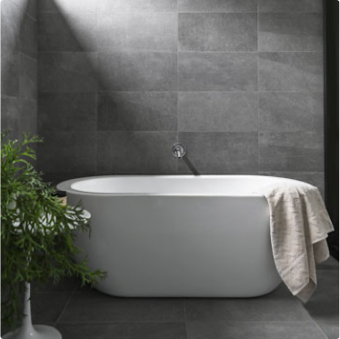
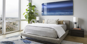
- Blue: Often associated with calmness and serenity, blue promotes feelings of tranquility and stability. It’s an ideal color for bedrooms, bathrooms, or spaces where relaxation is essential.
- Yellow: Representing optimism and happiness, yellow exudes warmth and positivity. Use yellow in spaces that need an energetic and uplifting vibe, such as kitchens or playrooms.
- Green: A symbol of nature and growth, green fosters balance and harmony. It’s ideal for spaces intended for relaxation, like living rooms or outdoor areas.
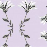
- Purple: Conveying luxury and sophistication, purple can evoke a sense of mystery and creativity. Use it as an accent color in areas that could benefit from an air of elegance, such as bedrooms or home offices.
- Orange: Combining the energy of red and the warmth of yellow, orange radiates enthusiasm and creativity. It works well in spaces that encourage socialization, such as living rooms or entertainment areas.
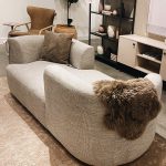
- Neutral Colors (e.g., Gray, Beige): These hues provide a versatile backdrop that complements other colors. They are often used as a canvas for more vibrant accents or to create minimalist, calming environments.

Creating Specific Atmospheres with Color
Now that we’ve explored the emotional impact of various colors, let’s discuss how to use them in home design to achieve specific atmospheres.
- Calming Retreat: To design a calming oasis, opt for a monochromatic scheme using cool colors like soft blues and greens. Add textures such as natural wood and plush fabrics to enhance comfort and serenity.
- Vibrant and Energetic: If you seek a space that radiates energy, incorporate bold, contrasting colors like red and yellow with accents of orange. Balance the vivacity with neutral tones to avoid overwhelming the senses.
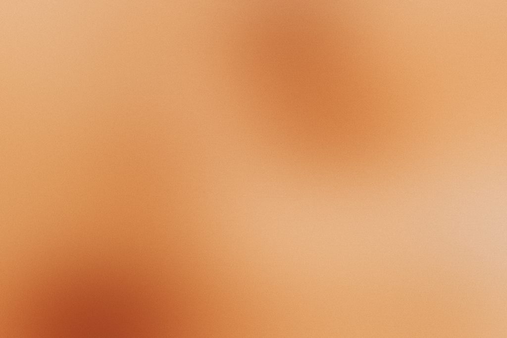
- Cozy and Inviting: Earthy tones like warm browns and soft oranges create a welcoming ambiance. Combine these colors with soft lighting and cozy furnishings for a comforting feel.
- Modern and Sleek: Achieve a contemporary look by focusing on clean lines and contrasting color schemes, such as black and white or gray with bright pops of color as accents.
- Romantic Retreat: Embrace soft, romantic colors like pastel pinks and lavenders, and pair them with delicate textiles like lace or silk to evoke a sense of romance and intimacy.
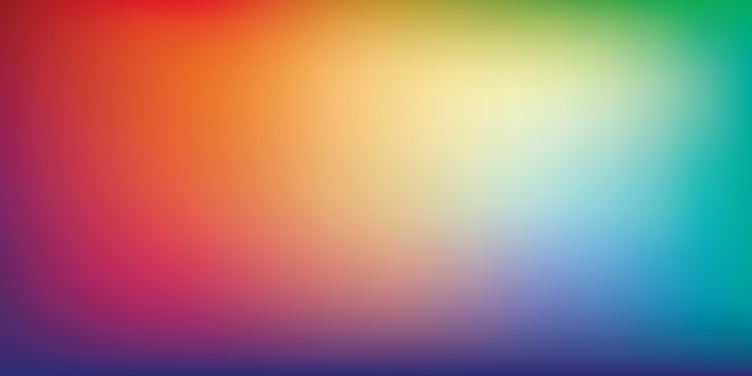
Harmonizing Color Combinations
While it’s essential to understand the emotional impact of individual colors, harmonizing color combinations can elevate the overall design. Some popular combinations include:
- Analogous Colors: Colors that are adjacent on the color wheel, such as blue and green or orange and yellow, create a sense of harmony and flow.
- Complementary Colors: Colors opposite each other on the color wheel, like blue and orange or red and green, provide a striking and energetic contrast.
- Monochromatic Tones: Utilizing various shades of the same color creates a sophisticated and cohesive look, allowing for a seamless flow throughout the space.
Harnessing the emotional power of colors is crucial in creating spaces that resonate with individuals on a deeper level. By understanding the psychology behind each hue and combining them strategically, you can craft harmonious environments that evoke desired emotions and atmospheres. The art of color in design is a remarkable journey of expression, and with a thoughtful approach, it can transform any space into an awe-inspiring masterpiece. Don’t just take our word for it. Check out this great article about color in interior design from Homes & Garden.